
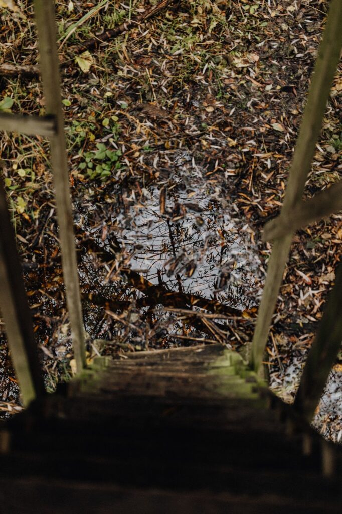
Visually impaired people often complain that stairs without contrasting markings appear to be ramps, making them unclear in their approach, unable to determine precisely where the stairway begins and ends and the height of the steps. To illustrate, take a look at the two photos below. Even for people with sharp vision, the steps of the staircase are washed together, making it difficult to see the edges of the stairs. And for people with low vision, the two flights of stairs may appear to be a nearly continuous line, like a slide.

Have you ever experienced a “phantom step”? The weird sensation felt when one reaches the top or bottom of a flight of stairs one step sooner than expected. We can save everyone (including visually impaired people) from this unpleasant and, in some cases, dangerous experience by marking the staircase landings with contrasting markings.
For building owners and operators, the most frequently asked questions about contrasting stair marking are the following:
- Do all stair treads have to be marked?
- What colour can the marking be?
- Which part of the staircase should the marking be placed in?
- How wide should the marking be?
- What material should the marking be made of?
- How long should the marking extend?
It is essential to notice that these questions focus on standardisation or compliance, not usability and utility. In this article, my goal is to answer each of these questions but with an emphasis on usability.
Let’s start with some possible solutions and good examples that correspond to real-world usability.
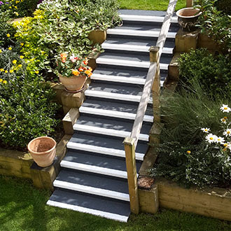
The first example (Figure 3) shows a staircase with the first and last stair treads coloured with a yellow marking stripe across the entire width of the staircase. In front of the staircase, there are also tactile markings, which are helpful for visually impaired and blind people.

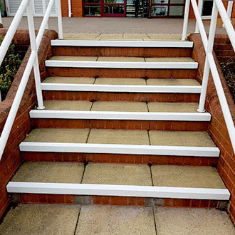
The following image is an example of metal tactile markings. In addition to the tactile markings, all steps of the staircase are contrasting and detectable.

The next image (Figure 5) shows stair edge markings implemented in a historical setting. In buildings where the stair edges cannot be modified – for example, for heritage reasons – it is recommended that a non-slip and contrasting strip is placed on each stair tread. The photo is black and white, but the high contrast makes the marking clearly visible. On light-coloured stairs, a dark-coloured stripe (or, where appropriate, a bright-coloured stripe on dark-coloured stairs) is required to achieve a contrasting effect.

Black, non-slip stair markings are also used on the visitor routes of the Château de Versailles (Figures 6 and 7).


After these examples, here are the answers to the frequently asked questions.
Do all the steps have to be marked?
At least the first and last steps of the staircase should be marked with a contrasting marking. If only these are marked, the width of the marking strip should be between 5 and 10 cm. (It is important not to confuse contrasting markings with tactile markings for blind people. However, let us think back to the initial problem: it is difficult for visually impaired people to determine the beginning and end of the stairs and the height of the steps. It is advisable to mark the edges of all steps with non-slip, contrasting markings.
What colour should the marking be?
Focus on contrast instead of colour; there are no unacceptable colours. Dark stairs should be marked light, and light stairs dark. In the previous examples, we have seen different solutions. The yellow-black colour combination is often used because it is noticeable even on a patterned background and in poor lighting.
Where should the marking be placed on the stairs?
It can be a contrasting colour for the edge protector or, in the case of a marking strip, a marking placed no more than 1-1.5 cm from the edge. The marking may also be placed on the faceplate 1 cm from the top of the stair. (See figure 8)
How wide should the marking be?
The aim is to be clearly visible, but the recommended width of the marking strip placed on each step is 4-5 cm. (Figure 8) (If only the first and last steps are placed, the contrasting marking strip should be between 5-10 cm wide.)

What material should the marking be made of?
It can be constructed, glued or even painted. Outdoors, it is particularly important that it remains slip-resistant. As long as it achieves its purpose, i.e. making the staircase visible to visually impaired people due to contrast, it is suitable. The picture on the left (Figure 9) shows a glued edge marking, and the picture on the right (Figure 10) shows a built edge marking.
How wide should the marking run?
The marking should run the entire width of the stair. The photo below shows a bad example (Figure 11) of a staircase where the treads are marked starting from the left but not along the entire length of the staircase. Recall the initial problem that the unmarked parts wash into one for visually impaired people. Unmarked sections can be perceived as ramps by a visually impaired person; a wrong step can cause an accident.
A barrier-free environment is suitable for everyone. Contrasting stair markings are inexpensive, quick to implement and can be aesthetically pleasing to any interior.
Text: Anna Kepes
Access4you is a social impact startup: we survey and evaluate buildings to provide detailed, credible information about the built environment for the special needs community. Based on the results, we issue a certificate stating that the location is entitled to use the ‘Access4you’ European certification mark, and the detailed data of the site will be publicly available in the access4you.io database and mobile application.
For more information: https://access4you.io/b2b